Excel is a powerful tool that goes beyond simple data storage and calculations. One of its standout features is the ability to create charts that make your data visually engaging and easier to understand. Whether you're a beginner or looking to refine your skills, this guide will help you master Excel charts.

Highlighting trends and patterns.Making data comparisons straightforward.Presenting complex data in a visually appealing way.
Types of Charts in Excel
1. Column and Bar Charts
Use Case: Compare values across categories.
Example: Sales figures across different months.
2. Line Chart
Use Case: Show trends over time.
Example: Website traffic growth over a year.
3. Pie Chart
Use Case: Represent parts of a whole.
Example: Market share of different companies.
4. Scatter Plot
Use Case: Show relationships between two variables.
Example: Height vs. weight data.
5. Combination Chart
Use Case: Display multiple data sets in one chart.
Example: Revenue and profit on the same graph.
How to Create a Chart in Excel
Step 1: Prepare Your Data
Ensure your data is organized in rows and columns with clear headings.
Step 2: Select Your Data
Highlight the range of data you want to include in your chart.
Step 3: Insert the Chart
Go to the Insert tab on the ribbon.
Choose the chart type that suits your data.
Step 4: Customize the Chart
Add a title: Double-click the chart title and type your desired title.
Format axes: Right-click the axis and choose "Format Axis."
Adjust colors: Use the "Chart Tools" to match your theme.
Tips for Effective Charts
Choose the Right Chart Type: Match the chart type to your data.
Keep It Simple: Avoid clutter by focusing on key data points.
Label Everything: Ensure all axes, titles, and data points are clearly labeled.
Use Colors Wisely: Use contrasting colors to highlight important data.
Test Readability: Ensure your chart is easy to understand at a glance.
Advanced Features
1. Dynamic Charts
Use named ranges or tables to create charts that update automatically as your data changes.
2. Combo Charts
Combine two chart types to represent multiple data sets effectively.
3. Custom Templates
Save your chart as a template for consistent formatting across projects.
Common Mistakes to Avoid
Overloading charts with too much data.
Using the wrong chart type for the data.
Ignoring data accuracy.
Choosing overly complex designs.
Practical Example: Creating a Sales Chart
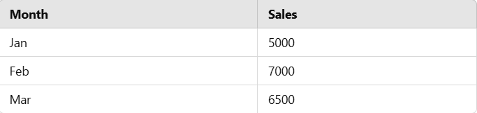
Steps:
Highlight the data.
Insert a column chart.
Add a title: "Monthly Sales."
Format the bars with a gradient fill.
Result: A visually appealing chart that shows monthly sales trends.
Excel charts are more than just a way to represent data—they’re a powerful storytelling tool. With practice and the tips in this guide, you can create professional, impactful charts that bring your data to life.
Write Us- Support@virvijay.com.

.jpg)


.png)