
Welcome back to Virvijay.com, your one-stop destination for mastering Power BI! 🔥
So far, we've explored data modeling, DAX fundamentals, and advanced calculations. Now, let’s bring everything together by creating interactive dashboards that will wow your audience!

By the end of this blog, you’ll learn:
- ✅ How to design a professional Power BI dashboard.
- ✅ The best practices for choosing the right visuals.
- ✅ How to add interactivity with slicers, filters, and bookmarks.
- ✅ How to enhance user experience with tooltips, drill-through, and conditional formatting.
Let's build a dashboard that tells a story! 🚀
1️⃣ What is a Power BI Dashboard?
A dashboard is a single-page interactive report that provides insights at a glance. Unlike reports, dashboards:
- 🔹 Are designed for decision-makers.
- 🔹 Show key metrics and KPIs.
- 🔹 Combine multiple data sources into a single view.
- 🔹 Allow real-time interactivity for users.
A well-designed dashboard makes it easy to track trends, compare data, and make informed decisions.
2️⃣ Planning Your Dashboard: Key Considerations
📌 Before creating a dashboard, ask yourself:
- ✅ Who is the audience? (Executives, sales teams, finance managers, etc.)
- ✅ What story do I want to tell? (Sales trends, customer behavior, operational performance, etc.)
- ✅ What KPIs matter? (Revenue, growth rate, conversion rates, etc.)
Example Use Case:
Imagine we are building a Sales Performance Dashboard for a retail company.
Key KPIs to include:
📌 Total Sales 📌 Sales by Region 📌 Top 5 Products 📌 Sales Trend Over Time
3️⃣ Choosing the Right Visuals for Your Dashboard
Power BI offers many visuals, but choosing the right one improves clarity and impact.
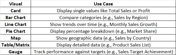
🚀 Tip: Avoid using too many Pie Charts – they can be hard to read!
4️⃣ Step-by-Step: Building an Interactive Power BI Dashboard
🔹 Step 1: Import Your Data
- 1️⃣ Open Power BI and click Home > Get Data.
- 2️⃣ Choose your data source (Excel, SQL Server, or a CSV file).
- 3️⃣ Click Load to bring the data into Power BI.
🔹 Step 2: Create Key Measures Using DAX
Instead of using raw columns, create measures for better performance.
📌 Total Sales Calculation
DAX
TotalSales = SUM(Sales[Amount])
📌 Sales Growth Rate
DAX
SalesGrowth = DIVIDE(TotalSales - CALCULATE(TotalSales, SAMEPERIODLASTYEAR(Sales[OrderDate])), CALCULATE(TotalSales, SAMEPERIODLASTYEAR(Sales[OrderDate])))
📌 Top 5 Selling Products
DAX
Top5Products = TOPN(5, SUMMARIZE(Sales, Sales[Product], "Total Sales", SUM(Sales[Amount])), [Total Sales], DESC)
🚀 Tip: Use measures instead of calculated columns for faster performance!
🔹 Step 3: Add and Format Visuals
- 1️⃣ Click Insert > Visualizations and choose a Bar Chart for Sales by Region.
- 2️⃣ Drag Region to the Axis and Total Sales to the Values field.
- 3️⃣ Click Insert > Card Visual to display Total Sales as a KPI.
- 4️⃣ Use a Line Chart to show monthly sales trends over time.
- 5️⃣ Insert a Map Visual to display Sales by Country.
🚀 Tip: Keep your visuals aligned and consistent for a clean layout!
🔹 Step 4: Add Interactivity with Slicers & Filters
- 1️⃣ Click Insert > Slicer and choose Order Date for a time filter.
- 2️⃣ Add another slicer for Product Category so users can filter data.
- 3️⃣ Go to Format > Edit Interactions to control how slicers affect visuals.
📌 Dynamic Filtering Example
Want to show only data from the last 12 months? Use this DAX filter:
DAX
Last12Months = FILTER(Sales, Sales[OrderDate] >= TODAY() - 365)
🚀 Tip: Use slicers instead of filters in visuals for a better user experience!
🔹 Step 5: Enhance User Experience with Tooltips & Drill-through
✅ Enable Tooltips
- Go to Format > Tooltip and enable it.
- Add additional details (e.g., Profit, Discounts) for better insights.
✅ Drill-through to Detailed Reports
- Right-click on a visual and select Drill-through to show more details.
🚀 Tip: Use conditional formatting to highlight important data points!
🔹 Step 6: Publish and Share Your Dashboard
- 1️⃣ Click File > Publish to Power BI Service.
- 2️⃣ Choose a workspace and upload your report.
- 3️⃣ Click Share to distribute it to stakeholders.
🚀 Tip: Set up scheduled refreshes to keep data up to date!
5️⃣ Dashboard Design Best Practices
- ✅ Keep it simple – Avoid clutter, focus on key insights.
- ✅ Use consistent colors – Make visuals easy to read.
- ✅ Limit the number of visuals – Too many can confuse users.
- ✅ Optimize performance – Use measures instead of calculated columns.
- ✅ Add context – Use titles, tooltips, and labels for clarity.
🚀 Example: Ideal Dashboard Layout
- 📌 Top Section: KPIs (Total Sales, Growth, Profit)
- 📌 Middle Section: Key Trends (Sales by Region, Monthly Growth)
- 📌 Bottom Section: Drill-through visuals (Product Breakdown, Discounts, Profit Margins)
6️⃣ What's Next?
Now that you've created a fully interactive Power BI dashboard, it's time to take it to the next level!
📌 In the next blog, you’ll learn:
- ✅ How to use Power BI Service for sharing & automation.
- ✅ How to create real-time dashboards with live data.
- ✅ How to optimize your Power BI reports for faster performance.
Stay tuned to Virvijay.com for expert Power BI insights! 🚀
💡 Did you find this blog helpful? Share it with your network!
Write us support@virvijay.com

.jpg)


